Tuesday, May 29, 2018

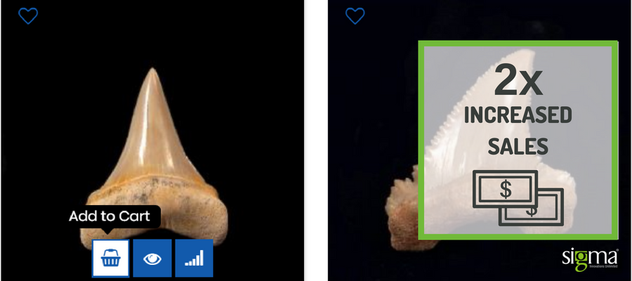
Buried Treasure Fossil achieves 2X revenues by focusing on Magento store Maintenance

“Having the site page and product opening performance restored is great news. Thanks to Sigma and the team. I received 4 orders in the past 4 hours.”
– Gary Greaser
Owner, BTF
Buried Treasure Fossil is the place for new and seasoned fossil collectors, providing a wide range of incredible fossils to choose from. As a purely online business, BTF strategy is to offer great fossils at great prices, and super service for customers across the USA. The relatively young company is owned by Gary Greaser, an avid enthusiast, and collector of the fossils. Having realized that migrating to Magento Opensource from Magento 1.7 could enable him to boost his sales while delivering an excellent customer experience, Gary chose Sigma to migrate their site to Magento Opensource which was completed and went live in 4 months.
The team worked hard to ensure that all features and functionally made it easier for customers to navigate through the site. Some of the enhancements like Featured Category on the homepage and filtration of the fossils by species enabled customers to find what they need in half the time that was required earlier. By using landing pages for product categories, customers could see all relevant information about a specific fossil on the product page, and add it directly to their cart.
Present Business Need

Launching an e-commerce site takes a lot of work, and so does effectively supporting, maintaining, and evolving it. Proactive maintenance, site updates and applying security patches are a critical part of managing an e-commerce site.
As with many companies, Buried Treasure Fossil does not have the in-house tech team to keep a modern e-commerce site running effectively and securely while the business is growing. To bridge this gap, Sigma is responsible for keeping their site running optimally – both from a technology and a marketing perspective.

Support and Maintenance

The team defines and prioritizes the site updates, functional improvements, patches and site issues when they arise. For every task, we have a turn around time of 4 to 8 hrs. We track these changes and issues within our issue tracking tool – JIRA, assign a unique tracking number to each task and get them done. We have regular status calls and generate weekly reports in order to track the progress of all support issues and to ensure the process is being followed and most importantly, expectations are being met.
Sigma’s client support activities include a combination of the following activities:
  • Ongoing website maintenance
  • Troubleshooting for technical issues
  • Magento training to clients hold of their Magento store
  • Performance improvement
  • Website speed optimization
  • Feature up gradation and installations
  • Security patch updates
  • Suggestions and solutions for improved search engine ranking
  • Solution to the server or hosting related problems
  • Daily status reports and weekly progress reports
Sigma Magento Experts are always ready for any kind of Magento support and maintenance. We work as the client’s go-to experts and help them with up-gradation of software and improved functionality with new and updated features in the E-commerce website.
Based on customer requirements and hourly support they need, we offer customized Magento maintenance and support monthly packages. We discuss clients’ requirements and agree with them for a particular number of hours per month and make a schedule as per their suitability to catch up during business hours through telephonic, email, chat, video chat and face to face support.

Friday, April 27, 2018

Top 5 Magento Enterprise Edition Features – 2018 - Sigma Infosolutions


A good number of small scale and medium scale businesses prefer the Magento Community Edition for being budget friendly but the Magento Enterprise Edition is built for the development of a rapid and cost-effective innovation in the long run. The platform uses a combination of rich, out-of-the-box functionality, enterprise performance and powerful business tools to get ahead of increasingly complex commerce operations and growing customer demands.
Let us take a look at some of the Magento Enterprise features—
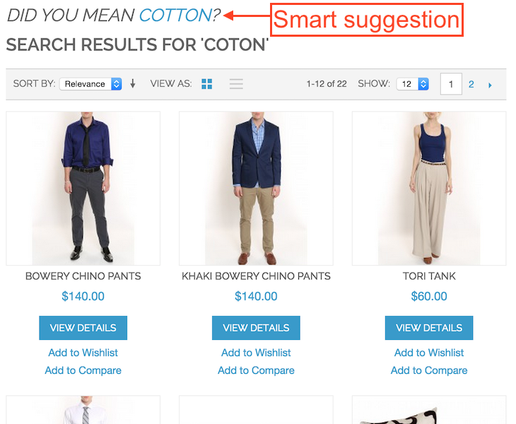
1. Advanced Search –Magento Enterprise Edition includes Elastic Search for the most powerful customer search experience, with advanced search rules that deliver the results your customers expect. Magento 2 EEs Elastic search comes with powerful features such as
  1. Automatic suggestion for better user experience (aka “Did you mean?” feature)
  2. Very fast autocomplete
  3. Smart correction when text query is misspelled
  4. Search for product attribute options
And much more.
2. Advanced Targeting and Segmentation tools – Magento 2 Enterprise Edition has an interesting feature that allows you to dynamically display content and promotions to specific customers, based on properties such as customer address, order history, shopping cart contents and so on.You can also optimize marketing initiatives based on targeted segments by using shopping cart price rules and banners. Because customer segment information is dynamic and is constantly refreshed, customers can become associated and disassociated from a segment as they continue shopping from the online store.
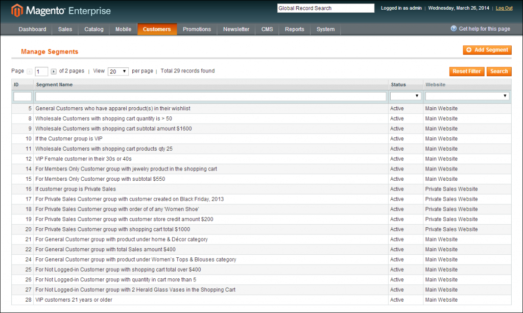
This boosts the conversion rate for the business and creates a unique shopping experience for their customers, promising more potential ones.
3. Advanced Merchandising and Promotion –Grabbing a customer’s attention is an expensive task. Once you have got it, the next challenge is how do you show your customers the right products and promotions to increase your chances of making a sale? Merchandising and promotion are great tools to increase conversion rates. Drag and drop merchandising, flexible pricing and promotions, rules-based cross-sales and up-sales, and customer segmentation tools are all features of Magento Enterprise Edition that help you automate creative strategies for maximizing customer sales.
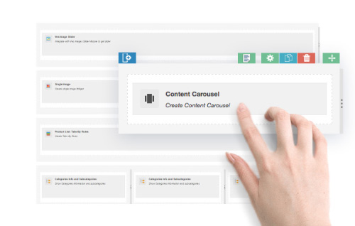
4. Advanced Content Management –Integrating third-party CMS solutions to your Magento build adds cost and complexity. Magento 2 Enterprise Edition includes drag-and-drop content management capability with staging and preview features that allow your content creators to build content and get it approved without involving a developer.
5. B2B Support –Business-to-business eCommerce is growing. Companies are working on their B2B eCommerce strategy, increasing the competition. Many companies are using an obsolete custom-built eCommerce platform, or don’t have one at all. A proper eCommerce platform for B2B allows your business to grow by giving smaller customers an opportunity to self-service, allowing you to focus on higher-value customers. Magento’s B2B functionality includes requisition lists, quotes, negotiated pricing, product exclusivity, and corporate accounts. These built-in features allow you to focus on customizing the features that are unique to your business operation.
While Magento 2 has an affordable Community plan perfect for small businesses, companies who are serious about e-Commerce or drive high revenue are encouraged to invest in Magento 2 Enterprise.
It offers different payment methods for you and your customers. You can download these as extensions to your Magento account for different Magento Enterprise pricing options. These include:
Amazon Pay: You can integrate Amazon Pay into your Magento account.
Apple Pay: Your customers can easily purchase your products through their iOS device or on their Apple ID.
Google Wallet: You can accept payments from your customer’s Google accounts and from the card they have saved in their Google Wallet.
Bitcoin and Altcoins: Because of its security and effectiveness, more digital consumers are choosing bitcoins and altcoins as payment methods. Accepting bitcoins and altcoins can help your store attract these consumers.
PayPal: This payment service is by far the most widely used because of its efficiency and safety. PayPal is also great for international shoppers.
These extension options and add-ons will help you appeal to a wider audience while also benefitting you in terms of gaining revenue. It is important to identify the right platform based on your business needs. Magento Enterprise Edition allows the businesses to build a well-designed, responsive and secure website, enabling the owner to control the web store efficiently in order to scale up their online marketing game.

Friday, April 20, 2018

Advantages of Using Magento Enterprise Edition - Sigma Infosolutions


Magento Enterprise Edition blurs the lines between what is possible; giving the business owner the power to create bold and unique shopping experiences that will transform the customer’s experience on the website. Although many small to medium businesses prefer the Magento Community edition for being budget-friendly, the Magento Enterprise edition is built for rapid and cost-effective innovation in the long run. The platform combines rich, out-of-the-box functionality, enterprise performance and scale, and powerful business tools to get ahead of increasingly complex commerce operations and growing customer demands. Let us take a look at some of the Magento Enterprise features which make it stand out from the Magento Community edition:
1. Enhanced Enterprise Efficiency & Flexibility
Magento Enterprise Edition comes with a powerful Admin experience. The modern and intuitive user interface allows the owners to effectively manage and maintain online stores. The Admin dashboard comes with a quick access to the sales, orders, product data and other features saving the time during administrative tasks. It comes with features that allow the users to save and customize the views in the Admin Panel. Magento Enterprise Edition’s step-by-step product creation tool guide has made it very simple and 4 times faster to add new products to the store.
2. Customer Segmentation and Personalization
Magento Enterprise Edition has an interesting feature that allows the segmentation of the users based on gender, location, history, purchasing value, wish-list and other factors and provides more marketing options. It also allows creating personalized shopping experiences by dynamically displaying promotions and content based on the demographic and geographic behavior of the target audience. This boosts the conversion rate and creates a unique shopping experience.
3. Elasticsearch
Magento Enterprise Edition has an integrated Elastic search technology which makes it very easy to set up and handle large catalogs efficiently. It manages global search-results in 33 languages which gives the Magento Enterprise Edition extra brownie points. Elasticsearch offers suggestions for misspellings, synonym management and support for stop words helping in increasing the conversion rate.
4. Better Payment Security
Magento  Enterprise edition provides a secure payment gateway for the payments. It comes with integrated payment gateways like Braintree, PayPal, Authorize.net, CyberSource and WorldPay securing the payments. Although the Magento Community Edition users can get payment extensions through Magento Marketplace, the problem with using a lot of third-party extensions is that sometimes they can conflict with each other, causing problems and instability in the system.Magento 2 Enterprise Edition comes with secure payment gateway and PCI complaint standards to make the whole process of purchasing super-fast and equally secure.
5. Full Page Caching
When it comes to your website’s performance, EE makes it possible for your site to grow without limits. Whenever a user visits or re-visits the website, the updated version of Magento displays the HTML cached data stored in the buffer area rather than fetching the information from the database. The benefit of full-page caching is that it reduces the load-time on the server, improving the response time and boosting the performance. In times of high traffic, full page caching helps in avoiding the downtime as the load on the server is reduced.
6. Easy Checkout Process
Magento EE has been successfully enhanced with the highly customizable interface to place orders and complete the checkout process. The platform is now 50% faster, requires a very few steps and customer related information while making the purchases. This has made the checkout process easier, quicker and secure as compared to the previous version.
It is vital to select the right platform based on the business needs. A smaller company that doesn’t need the upgraded performance capabilities or advanced features that Magento Enterprise offers, is advised to go with the Community Edition. However, for chasing a larger audience, Enterprise Edition enables you to reach specific segments and grant much more flexible options.  Magento enterprise edition allows the businesses to build a well-designed, responsive and secure website, enabling the owner to control the web store efficiently in order to scale up their online marketing game.

Friday, April 13, 2018

Ecommerce Web Design Trends for 2018


An e-commerce business is not successful for just the products or services it sells or how well it markets them, but by the way, it designs its websites for user’s ease of access, functionality, and features. When you are starting out as an e-commerce business or one that is already set up shop in the World Wide Web, then you need to remember that you are right away competing with the well-established businesses that preceded you. You cannot just be famous by being the new kid on the block, the first things that users of your website will look for are how you have aesthetically designed it, how you connect with them, and ultimately how your e-commerce website appeals to them. To drive that appeal to the user, you need to ensure that your website is not simply a page with tools, but has the required administrative features that are embedded naturally into your business process. Customers enjoy innovation and creativity, and these are driving factors that can increase their affluence towards your business. Some of the top trends that are key to driving customer satisfaction and influencing sales are:
Guided selling
There is the no bigger joy for a customer than a website that has an interactive website that perks up the interest and picks out the right list of items they are looking for based on their selected preference. Guided selling makes it all the more interesting as it is more than a filter option and a shorter more attractive form of a form where a customer is asked to choose and navigate through the website with ease. A good example of guided selling is found on Victoria’s secret page for selecting a sports bra.
Micro-interactions
The best examples of micro-interactions are the like button that pops up when clicked on in Facebook, and the payment success symbol that opens up when your payment has fallen through on the modern day payment portals. Having plenty of apt micro interaction features in an e-commerce website definitely encourages the user to be more interactive and actively participate in adding items to a shopping cart, subscribe to a service, or provide feedback. According to the author Dan Saffer, Microinteractions, there are four main parts to a micro interaction:
  • A trigger that initiates or begins the micro-interaction.
  • Rules that define or determine what happens in the interaction.
  • Feedback communicates what is happening or what just happened.
  • Loops and modes which govern, if you will, the content.
Using product pages as landing pages
The reason Apple Store’s landing page designs are mystically beautiful is that its web pages are designed with simple yet catchy descriptions to products, enhanced levels of photography, and the compelling placement of the call to action. Websites today are more focused on linking the landing pages to the product sale page as they have become an essential element of CRO. The best way to capture a customer’s attention is to set up cluster free landing pages that have relevant and concise content on a clean landing page design with an inviting and intriguing call to action feature. There is no better tool to drive sales when you can give the customer a mystical experience of shopping online.
Full-screen Search, Forms
Modals that are controlled typically with a script and overlaid as a cover over the page’s elements has been an effective user interface medium for quite some time. The only change that has modified the trend is that these models are now full-screen so that both the mobile and computer web design are similar for the search and forms features, and this seemingly captures the full attention of the user.
Material design and Card UI layouts
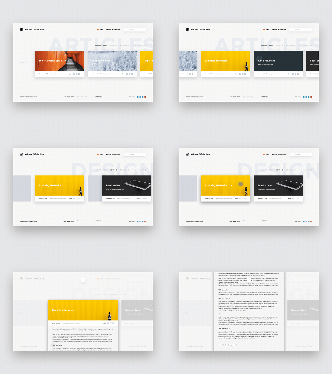
These two features are forming the face of most e-commerce web design and development is due to the seamless and engaging user experience that this layout provides. One of the best ways to improve brand recall and awareness is by adapting material designs that have a smooth and easy to access grid layout with customized transitions, shadow effects, and animations. More importantly, the material design is integral to increasing store level activity and engaging customers efficiently. Card UI layout is a sub-feature of material design and is the success factor of Pinterest’s appeal to visitors. The three key factors that drive the success of Card UI layouts are readability, responsive web design, and development to create the perfect fit for social media dominant store layouts.
When you build your web design to improve user experience, the end result is better site visits and a drive in overall sales. The change of a user to an active buyer depends on how far you can engage them onto your site and improve brand recall.

Friday, March 23, 2018

How to Design More Engaging Website Layouts

The traditional reading pattern is typical left to right in a row pattern. Internet users mostly scan web pages, omitting many words. In 2006, NN Group conducted eye-tracking visualizations on various web pages such as ‘about us’ pages, product, and the search results page. They found that users typically read web pages in the following manner: two full horizontal stripes followed by a vertical movement.
That is roughly an F-shaped pattern. The implication of this reading behavior has extensively influenced website design.
Incorporating F-Pattern into Landing Page Designing
In the course of designing a webpage, the UX designer should factor in the user’s reading behavior patterns to create an engaging landing page. Creating a visual hierarchy can help businesses to convert the users into potential customers at a quicker pace.
The F-Pattern design works best for pages that are text driven like blog posts, news articles, search result pages etc.  F – Pattern can also be used to create impressive landing pages so that the most important elements are exactly where your visitors are most likely to focus on them.
Keep in mind that viewers’ eyes will almost always start in the top left corner of the page before scanning the rest of the page. For example, if you need to incorporate a countdown for an offer, ensure to place it on the top left section. Then, design the rest of your landing page with a clear visual hierarchy and a flow that generates more conversions.
Getting the Landing Page Prepped in Tandem with F-Pattern
To avoid losing the interest of the reader, the UX designer must direct the flow of content appropriately, so that users will not take any bad shortcuts, but will stay interested in your page, and come back for more if they find the business reliable.
Basics for integrating F-Pattern into the landing pages are:
1. Highlight the content.
Once you have the content at hand, arrange them in the order of most to least important. This way, when structuring the page layout, the UX designer can place the priority content in usual hotspots and the remaining content where it is not a hindrance to the user.
2. Concentrate at the top of the page.
When a landing page opens, the user’s eyes are first directed towards the header and the first two paragraphs of content. Focus on the inverted pyramid style of organizing content and give the intrinsic details at the very beginning so that a user can get caught up on the page and then move down at their own pace rather than be disappointed to find nothing of relevance at the beginning of the page.
3. Focus on the scanning component rather than reading.
For introducing scanning content, the UX designer has to have the first few sentences of each paragraph contain the crux of the details, use side headings, use point format, highlight words, incorporate visual aids, etc.
4. Make use of the sidebars.
By setting up sub-landing pages that can help a user navigate to relevant content, a reader will be interested to use your content as a base source for delving further. This adds to the interactive tool concept because users don’t want too much content, but if they want more related info, then you can give them the options to choose from.
5. Don’t stick to an aesthetically flawed layout.
The visualization should not be monotonous or have jarring colors. Harmonize the page with the relevance of the content, and spice it up interesting tags so that a user is not made to see some jarring visualization but rather gets the optimum results out of your landing page.
The use of F-Pattern is just to smooth out the user experience on the page, and there are many other ways to do it. The effective use of this pattern coupled with the right creative tools can appeal to users faster than raw unprocessed or unplanned content. So the first step to meeting user expectation is making content user-friendly.

Friday, March 9, 2018

Designing Data Driven applications


Data is one of the key factors for businesses to identify its operational strengths and weaknesses. The key insights from data analysis can point out opportunities to boost performance and efficiency. Therefore the data-driven designing remains as much of an art as it is a science, especially for customer-facing applications with both a large number of users and large datasets. How an application presents data plays a huge role in UX
Following are some of the tips and tricks to develop simple and clear data-visualization for app dashboards, web pages, and so on.

UNDERSTAND CUSTOMER JOURNEY TO DELIVER RELEVANT DATA

Enabling customers to create their digital persona such as managing their accounts, checking their usage, and personalizing their services, etc is a game changer.
The three checkpoints that need to be considered are:
Inform: Customers pay attention when they’re offered helpful and useful data. For example, a travel booking tool that analyzes historical data to advise customers on when to purchase travel.
Connect: Data-driven apps and personalized experiences can connect users to brands. For example, an online shop that uses QR codes and a mobile app to blend advertising and online shopping.
Motivate: The ultimate goal of data is to influence customer behavior. Together, data and context drive participation and engagement.

EMPLOY USER PERSONAS TO DESIGN USEFUL DATA-DRIVEN DASHBOARDS

As much as artificial intelligence and machine learning will keep improving, most organizations will still need human intervention to crunch uncategorized data. Data-driven applications tend to be used by multiple persons within or outside of an organization, you need to identify those personas so you can organize your information architecture wireframes and tasks to meet everyone’s needs.

Here every user/persona has different taste in the data visualization, but the design takes care of each users interest
Erik Klimcz, the Senior Design Leader at Uber and Advanced Technologies Group, shared some actionable tips on Medium. He suggests UX designers need to first identify, then define users or personas for every project.

ACCESSIBILITY OVER AESTHETICS

It’s not just about making heavy, contextual data fluid and appealing. You also want to design data presentations that provide clarity on the following
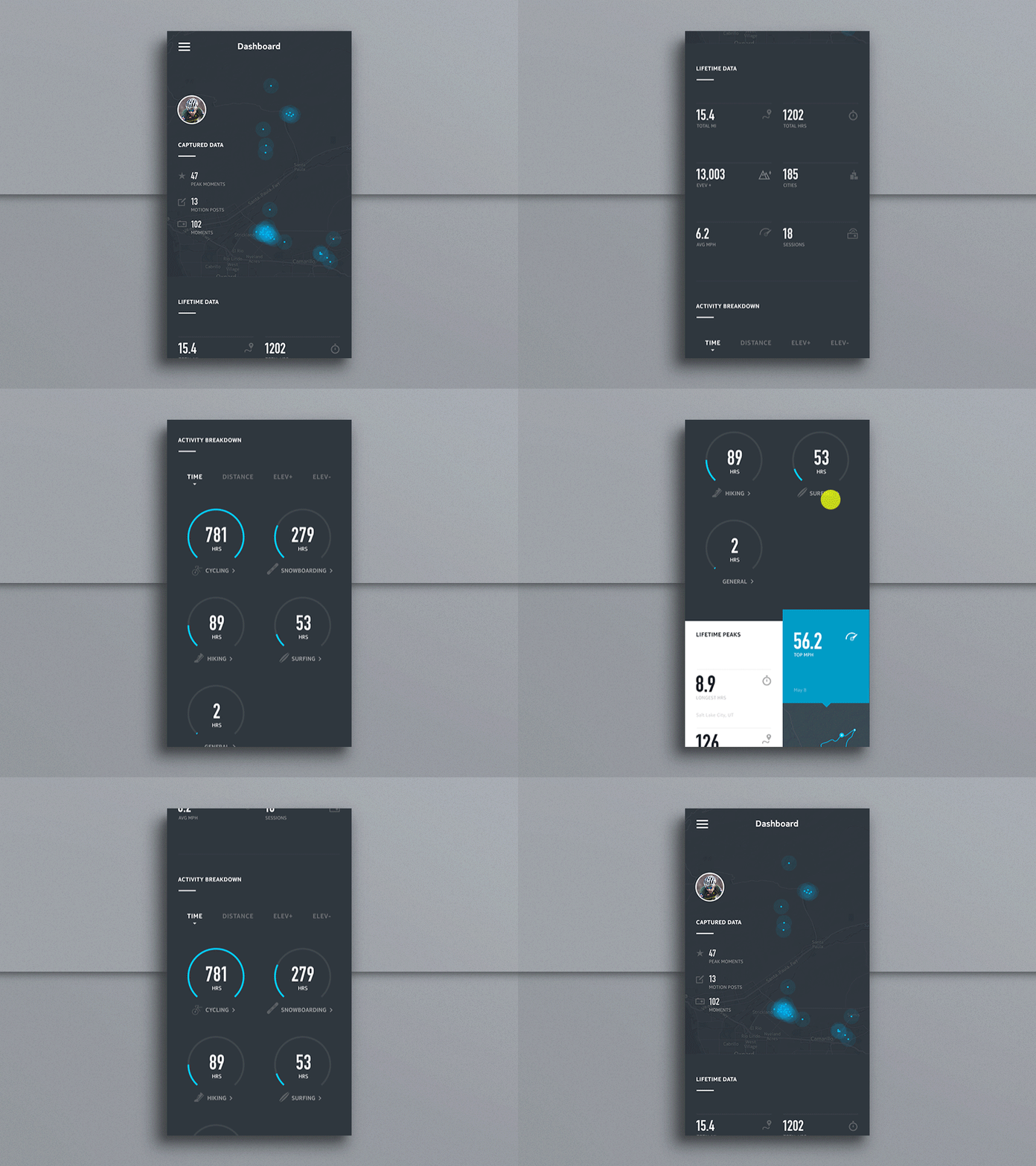
Users should know what data is the most important: One vital UX design principle is to observe and implement a hierarchy of information – in this case, visual hierarchy. You want to organize, arrange, and prioritize the most important data first, and additional data later. Of course, the order of priority will vary depending on the application’s user. Not only does doing this declutter the dashboard, but it also helps direct the user’s focus on what’s important to them in an easy to follow, less overwhelming way.

In the above example, we notice the captured data is given higher priority, followed by lifetime data and goes further to activity breakdown
Users should be able to comprehend the logical flow of data: Simplicity plays a major role in helping the user to connect the data to a certain outcome. You can add an intuitive drop-down menu, which when the user clicks, slides down to reveal additional information, and then specific tasks or items. People love this, and it’s gaining popularity already.
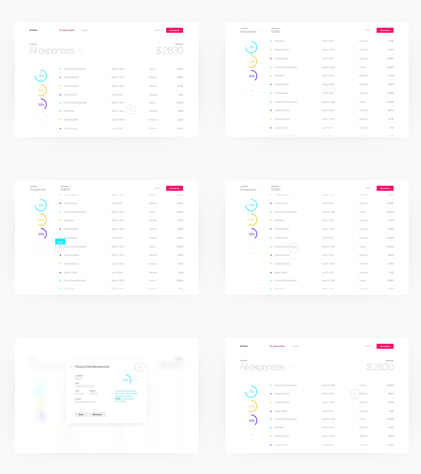
You can use clickable links or rollovers to reveal more information. Also, functions such as slide-to-reveal data and zoom-in-to-reveal are great ways to include additional information or highlight key data points. All using simple, natural gestures. This allows users to click on the links or rollovers they perceive as important to their job and leave the ones they consider less important.

This example shows a simple, elegant and comprehensive view of the data using various interactive functions
Use hover animations: You can use hover animation effects to add more zing, engagement, and usefulness to the (seemingly) dull data. Hover animations are particularly actionable for supplying additional information on specific tasks or items while helping to organize and clean up your data-driven application.
Users should be able to understand what the data means: After organizing and prioritizing data on the dashboard, the next step is to break down the data into separate pages. If it is possible to categorize the information, be sure to allocate different pages/screens for different data bundles.
Users should be able to understand the next step to take: Following hot on the steps above, it becomes easier for users to identify and relate patterns in the raw data – another key win to aim for when designing for data-heavy applications. When the data visualization tools you use help the users to make sense of big data, that’s when you know you have done a great job.

CONCLUSION

The purpose of UX design is to convey a message in a clear and actionable way. This is especially crucial for designing data-heavy applications. In this case, the business of good design is to help analysts or managers or end users make an informed decision. And users cannot interpret and use raw data to inform a decision if they do not make good sense of it and how it is presented. Designing for data-heavy UX projects should not be as exasperating as it seems. The above tips and tricks can help you figure out how to design for data-heavy interfaces.
Software Development Blogs - BlogCatalog Blog Directory RSS Search Technology Blogs - Blog Rankings Blog Directory