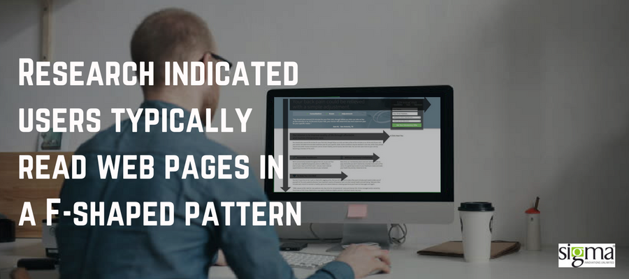
 The traditional reading pattern is typical left to right in a row pattern. Internet users mostly scan web pages, omitting many words. In 2006, NN Group conducted eye-tracking visualizations on various web pages such as ‘about us’ pages, product, and the search results page. They found that users typically read web pages in the following manner: two full horizontal stripes followed by a vertical movement.
That is roughly an F-shaped pattern. The implication of this reading behavior has extensively influenced website design.
Incorporating F-Pattern into Landing Page Designing
In the course of designing a webpage, the UX designer should factor in the user’s reading behavior patterns to create an engaging landing page. Creating a visual hierarchy can help businesses to convert the users into potential customers at a quicker pace.
The F-Pattern design works best for pages that are text driven like blog posts, news articles, search result pages etc. F – Pattern can also be used to create impressive landing pages so that the most important elements are exactly where your visitors are most likely to focus on them.
Keep in mind that viewers’ eyes will almost always start in the top left corner of the page before scanning the rest of the page. For example, if you need to incorporate a countdown for an offer, ensure to place it on the top left section. Then, design the rest of your landing page with a clear visual hierarchy and a flow that generates more conversions.
Getting the Landing Page Prepped in Tandem with F-Pattern
To avoid losing the interest of the reader, the UX designer must direct the flow of content appropriately, so that users will not take any bad shortcuts, but will stay interested in your page, and come back for more if they find the business reliable.
Basics for integrating F-Pattern into the landing pages are:
1. Highlight the content.
Once you have the content at hand, arrange them in the order of most to least important. This way, when structuring the page layout, the UX designer can place the priority content in usual hotspots and the remaining content where it is not a hindrance to the user.
2. Concentrate at the top of the page.
When a landing page opens, the user’s eyes are first directed towards the header and the first two paragraphs of content. Focus on the inverted pyramid style of organizing content and give the intrinsic details at the very beginning so that a user can get caught up on the page and then move down at their own pace rather than be disappointed to find nothing of relevance at the beginning of the page.
3. Focus on the scanning component rather than reading.
For introducing scanning content, the UX designer has to have the first few sentences of each paragraph contain the crux of the details, use side headings, use point format, highlight words, incorporate visual aids, etc.
4. Make use of the sidebars.
By setting up sub-landing pages that can help a user navigate to relevant content, a reader will be interested to use your content as a base source for delving further. This adds to the interactive tool concept because users don’t want too much content, but if they want more related info, then you can give them the options to choose from.
5. Don’t stick to an aesthetically flawed layout.
The visualization should not be monotonous or have jarring colors. Harmonize the page with the relevance of the content, and spice it up interesting tags so that a user is not made to see some jarring visualization but rather gets the optimum results out of your landing page.
The use of F-Pattern is just to smooth out the user experience on the page, and there are many other ways to do it. The effective use of this pattern coupled with the right creative tools can appeal to users faster than raw unprocessed or unplanned content. So the first step to meeting user expectation is making content user-friendly.

No comments:
Post a Comment