An e-commerce business is not successful for just the products or services it sells or how well it markets them, but by the way, it designs its websites for user’s ease of access, functionality, and features. When you are starting out as an e-commerce business or one that is already set up shop in the World Wide Web, then you need to remember that you are right away competing with the well-established businesses that preceded you. You cannot just be famous by being the new kid on the block, the first things that users of your website will look for are how you have aesthetically designed it, how you connect with them, and ultimately how your e-commerce website appeals to them. To drive that appeal to the user, you need to ensure that your website is not simply a page with tools, but has the required administrative features that are embedded naturally into your business process. Customers enjoy innovation and creativity, and these are driving factors that can increase their affluence towards your business. Some of the top trends that are key to driving customer satisfaction and influencing sales are:
Guided selling
There is the no bigger joy for a customer than a website that has an interactive website that perks up the interest and picks out the right list of items they are looking for based on their selected preference. Guided selling makes it all the more interesting as it is more than a filter option and a shorter more attractive form of a form where a customer is asked to choose and navigate through the website with ease. A good example of guided selling is found on Victoria’s secret page for selecting a sports bra.
Micro-interactions
The best examples of micro-interactions are the like button that pops up when clicked on in Facebook, and the payment success symbol that opens up when your payment has fallen through on the modern day payment portals. Having plenty of apt micro interaction features in an e-commerce website definitely encourages the user to be more interactive and actively participate in adding items to a shopping cart, subscribe to a service, or provide feedback. According to the author Dan Saffer, Microinteractions, there are four main parts to a micro interaction:
- A trigger that initiates or begins the micro-interaction.
- Rules that define or determine what happens in the interaction.
- Feedback communicates what is happening or what just happened.
- Loops and modes which govern, if you will, the content.
Using product pages as landing pages
The reason Apple Store’s landing page designs are mystically beautiful is that its web pages are designed with simple yet catchy descriptions to products, enhanced levels of photography, and the compelling placement of the call to action. Websites today are more focused on linking the landing pages to the product sale page as they have become an essential element of CRO. The best way to capture a customer’s attention is to set up cluster free landing pages that have relevant and concise content on a clean landing page design with an inviting and intriguing call to action feature. There is no better tool to drive sales when you can give the customer a mystical experience of shopping online.
Full-screen Search, Forms
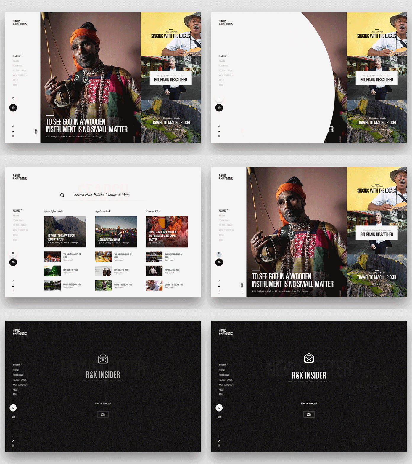
 Modals that are controlled typically with a script and overlaid as a cover over the page’s elements has been an effective user interface medium for quite some time. The only change that has modified the trend is that these models are now full-screen so that both the mobile and computer web design are similar for the search and forms features, and this seemingly captures the full attention of the user.
Material design and Card UI layouts
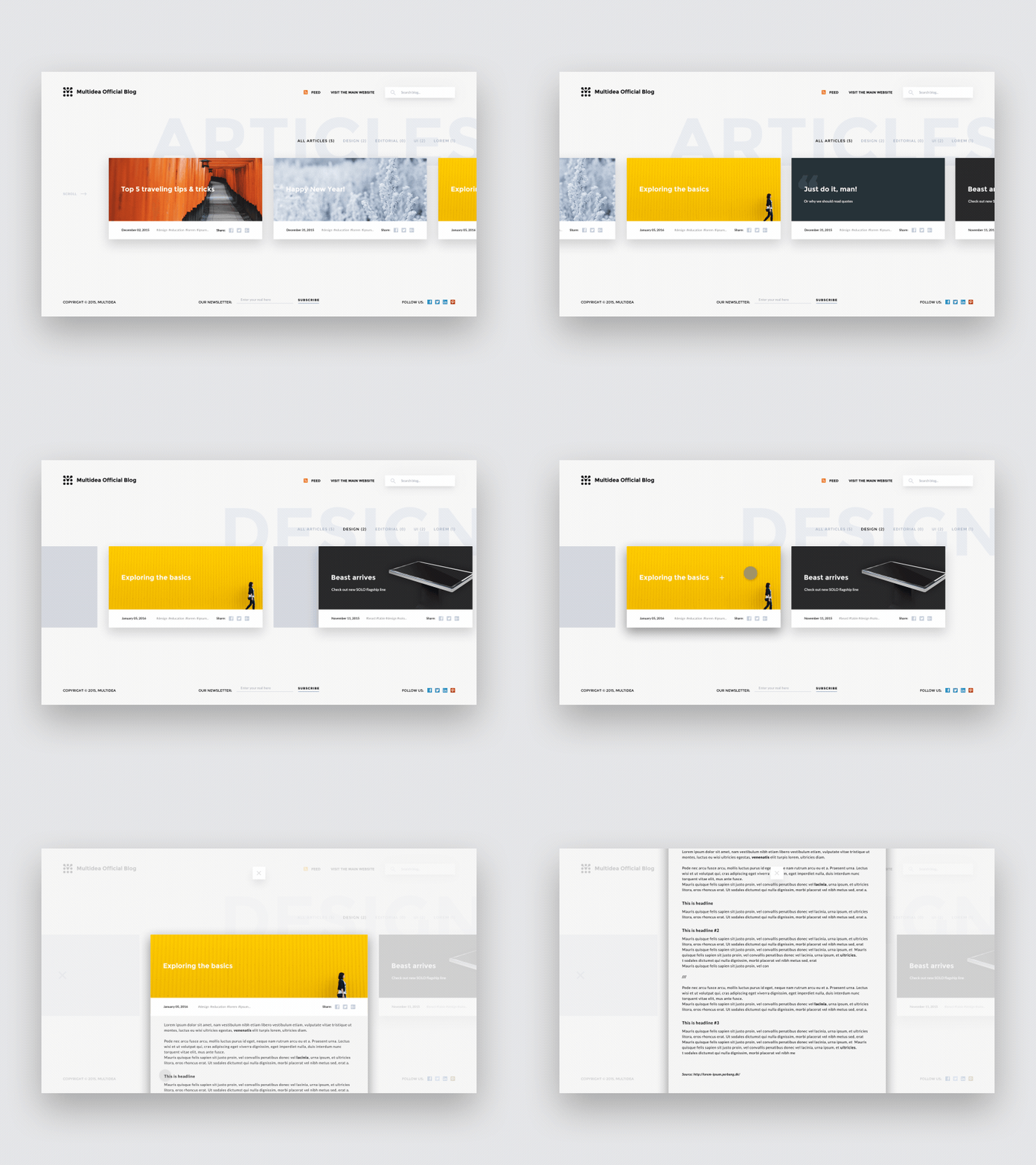
 These two features are forming the face of most e-commerce web design and development is due to the seamless and engaging user experience that this layout provides. One of the best ways to improve brand recall and awareness is by adapting material designs that have a smooth and easy to access grid layout with customized transitions, shadow effects, and animations. More importantly, the material design is integral to increasing store level activity and engaging customers efficiently. Card UI layout is a sub-feature of material design and is the success factor of Pinterest’s appeal to visitors. The three key factors that drive the success of Card UI layouts are readability, responsive web design, and development to create the perfect fit for social media dominant store layouts.
When you build your web design to improve user experience, the end result is better site visits and a drive in overall sales. The change of a user to an active buyer depends on how far you can engage them onto your site and improve brand recall.


No comments:
Post a Comment