Friday, March 23, 2018

How to Design More Engaging Website Layouts

The traditional reading pattern is typical left to right in a row pattern. Internet users mostly scan web pages, omitting many words. In 2006, NN Group conducted eye-tracking visualizations on various web pages such as ‘about us’ pages, product, and the search results page. They found that users typically read web pages in the following manner: two full horizontal stripes followed by a vertical movement.
That is roughly an F-shaped pattern. The implication of this reading behavior has extensively influenced website design.
Incorporating F-Pattern into Landing Page Designing
In the course of designing a webpage, the UX designer should factor in the user’s reading behavior patterns to create an engaging landing page. Creating a visual hierarchy can help businesses to convert the users into potential customers at a quicker pace.
The F-Pattern design works best for pages that are text driven like blog posts, news articles, search result pages etc.  F – Pattern can also be used to create impressive landing pages so that the most important elements are exactly where your visitors are most likely to focus on them.
Keep in mind that viewers’ eyes will almost always start in the top left corner of the page before scanning the rest of the page. For example, if you need to incorporate a countdown for an offer, ensure to place it on the top left section. Then, design the rest of your landing page with a clear visual hierarchy and a flow that generates more conversions.
Getting the Landing Page Prepped in Tandem with F-Pattern
To avoid losing the interest of the reader, the UX designer must direct the flow of content appropriately, so that users will not take any bad shortcuts, but will stay interested in your page, and come back for more if they find the business reliable.
Basics for integrating F-Pattern into the landing pages are:
1. Highlight the content.
Once you have the content at hand, arrange them in the order of most to least important. This way, when structuring the page layout, the UX designer can place the priority content in usual hotspots and the remaining content where it is not a hindrance to the user.
2. Concentrate at the top of the page.
When a landing page opens, the user’s eyes are first directed towards the header and the first two paragraphs of content. Focus on the inverted pyramid style of organizing content and give the intrinsic details at the very beginning so that a user can get caught up on the page and then move down at their own pace rather than be disappointed to find nothing of relevance at the beginning of the page.
3. Focus on the scanning component rather than reading.
For introducing scanning content, the UX designer has to have the first few sentences of each paragraph contain the crux of the details, use side headings, use point format, highlight words, incorporate visual aids, etc.
4. Make use of the sidebars.
By setting up sub-landing pages that can help a user navigate to relevant content, a reader will be interested to use your content as a base source for delving further. This adds to the interactive tool concept because users don’t want too much content, but if they want more related info, then you can give them the options to choose from.
5. Don’t stick to an aesthetically flawed layout.
The visualization should not be monotonous or have jarring colors. Harmonize the page with the relevance of the content, and spice it up interesting tags so that a user is not made to see some jarring visualization but rather gets the optimum results out of your landing page.
The use of F-Pattern is just to smooth out the user experience on the page, and there are many other ways to do it. The effective use of this pattern coupled with the right creative tools can appeal to users faster than raw unprocessed or unplanned content. So the first step to meeting user expectation is making content user-friendly.

Friday, March 9, 2018

Designing Data Driven applications


Data is one of the key factors for businesses to identify its operational strengths and weaknesses. The key insights from data analysis can point out opportunities to boost performance and efficiency. Therefore the data-driven designing remains as much of an art as it is a science, especially for customer-facing applications with both a large number of users and large datasets. How an application presents data plays a huge role in UX
Following are some of the tips and tricks to develop simple and clear data-visualization for app dashboards, web pages, and so on.

UNDERSTAND CUSTOMER JOURNEY TO DELIVER RELEVANT DATA

Enabling customers to create their digital persona such as managing their accounts, checking their usage, and personalizing their services, etc is a game changer.
The three checkpoints that need to be considered are:
Inform: Customers pay attention when they’re offered helpful and useful data. For example, a travel booking tool that analyzes historical data to advise customers on when to purchase travel.
Connect: Data-driven apps and personalized experiences can connect users to brands. For example, an online shop that uses QR codes and a mobile app to blend advertising and online shopping.
Motivate: The ultimate goal of data is to influence customer behavior. Together, data and context drive participation and engagement.

EMPLOY USER PERSONAS TO DESIGN USEFUL DATA-DRIVEN DASHBOARDS

As much as artificial intelligence and machine learning will keep improving, most organizations will still need human intervention to crunch uncategorized data. Data-driven applications tend to be used by multiple persons within or outside of an organization, you need to identify those personas so you can organize your information architecture wireframes and tasks to meet everyone’s needs.

Here every user/persona has different taste in the data visualization, but the design takes care of each users interest
Erik Klimcz, the Senior Design Leader at Uber and Advanced Technologies Group, shared some actionable tips on Medium. He suggests UX designers need to first identify, then define users or personas for every project.

ACCESSIBILITY OVER AESTHETICS

It’s not just about making heavy, contextual data fluid and appealing. You also want to design data presentations that provide clarity on the following
Users should know what data is the most important: One vital UX design principle is to observe and implement a hierarchy of information – in this case, visual hierarchy. You want to organize, arrange, and prioritize the most important data first, and additional data later. Of course, the order of priority will vary depending on the application’s user. Not only does doing this declutter the dashboard, but it also helps direct the user’s focus on what’s important to them in an easy to follow, less overwhelming way.

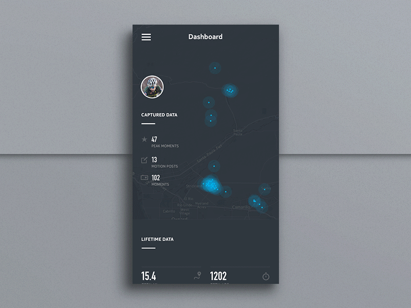
In the above example, we notice the captured data is given higher priority, followed by lifetime data and goes further to activity breakdown
Users should be able to comprehend the logical flow of data: Simplicity plays a major role in helping the user to connect the data to a certain outcome. You can add an intuitive drop-down menu, which when the user clicks, slides down to reveal additional information, and then specific tasks or items. People love this, and it’s gaining popularity already.
You can use clickable links or rollovers to reveal more information. Also, functions such as slide-to-reveal data and zoom-in-to-reveal are great ways to include additional information or highlight key data points. All using simple, natural gestures. This allows users to click on the links or rollovers they perceive as important to their job and leave the ones they consider less important.

This example shows a simple, elegant and comprehensive view of the data using various interactive functions
Use hover animations: You can use hover animation effects to add more zing, engagement, and usefulness to the (seemingly) dull data. Hover animations are particularly actionable for supplying additional information on specific tasks or items while helping to organize and clean up your data-driven application.
Users should be able to understand what the data means: After organizing and prioritizing data on the dashboard, the next step is to break down the data into separate pages. If it is possible to categorize the information, be sure to allocate different pages/screens for different data bundles.
Users should be able to understand the next step to take: Following hot on the steps above, it becomes easier for users to identify and relate patterns in the raw data – another key win to aim for when designing for data-heavy applications. When the data visualization tools you use help the users to make sense of big data, that’s when you know you have done a great job.

CONCLUSION

The purpose of UX design is to convey a message in a clear and actionable way. This is especially crucial for designing data-heavy applications. In this case, the business of good design is to help analysts or managers or end users make an informed decision. And users cannot interpret and use raw data to inform a decision if they do not make good sense of it and how it is presented. Designing for data-heavy UX projects should not be as exasperating as it seems. The above tips and tricks can help you figure out how to design for data-heavy interfaces.

Magento’s eCommerce Edge Over Opencart


Picking the right eCommerce platform for your business’s online existence is not so easy given that there are quite a variety of options available in the market with varying degree of features. Picking the best platform is important to ensure that both the business and its customers have the basic ease of use. Two eCommerce platforms that serve as open source PHP based content management systems (CMS) are Magento and Opencart. Since both these systems have no user fee for basic platform building, the difference markers between these sources are the customization and additional features. To narrow things and help your business make the right decision, here are five basic factors that reveal the pros and cons of both Magento and Opencart.
  • Access: The major line of difference between Magento and Opencart is its user interface, wherein the former eCommerce platform needs professionals to develop and customize features for businesses. On the contrary, Opencart allows businesses to equip the platform and get it running easily with its simple UI and inbuilt interface. Despite Magento’s complicated PHP interface, it offers the best options for building on a platform at any given point in time for the business.
  • Customization: Every business needs its unique signature to be imprinted on the eCommerce platform to build the brand. Magento stands miles apart from Opencart due to its extensive customization features that can help the business to experiment as well as build a user-catchy platform according to themes, seasons, special events, etc.
  • Content marketing: Magento’s other great advantage over Opencart lies in its smoothly integrated SEO tools. While the basic SEO tools are well structured in both Magento and Opencart, the major edge is that Magento’s tools are well-rooted and easier to master due to the incorporation of schema markup and canonical tags.
  • Market presence: Opencart is fairly new to the arena and has fewer adopters as compared to Magento that has more than 20% market share with more than 14,000 stores in Alexa’s top 1 million platforms. This existent presence of Magento gives its users the ability to connect and be backed easily on the web than any other eCommerce platform source on the market.
  • Costs: At the end of the day, the primary criteria for choosing between Magento and Opencart lies in its cost incurrences over time. While Opencart is fairly cheaper due to its simpler structure hosting, Magento needs businesses to spend based on the services being sought. However, the pricing of the features after hosting are heavy, Magento’s services match up to the costs.
One last criterion that could possibly help in making the final decision between Magento and Opencart lies in the scalability of the platforms over time. For a smaller company that just needs a website entry, Opencart can serve the easy route. For a business that is focused on growing over time and having the best user-interface would benefit from Magento as these eCommerce platforms are built for customization perfection with the best capabilities to monitor user behavior, etc. Magento offers the most up-to-date features for those businesses that are driven solely based on the internet presence. For a business that has specific needs that vary periodically, Magento would be a best-suited eCommerce platform, provided it is ready to invest in dedicated resources to get the platform up and functional from day one. 

What Magento 2 Enterprise can offer over Community


For an online-shop looking to scale its operations or looking at improving conversion rate, this is one of the key questions. Magento 2 EE comes with an exciting feature list such as multiple wish lists, automated e-mail marketing scheduling (multi-level re-targeting), customer segmentation, easy and hassle-free payments and much more to engage customers with an easy and safe shopping experience. These features make the customer’s shopping experience really smooth, making them like your brand and increasing the chances of their coming back to you.
While the cost is the main concern, there are many other reasons behind this dilemma.
Every e-commerce business is unique with a unique set of needs but we can detail some key differences between Community Edition and Enterprise Edition so that the merchants have a better understanding of where to start. Let’s take a look at them:
CostWhen comparing Magento 2 Community Edition and Magento 2 Enterprise Edition, the first visible difference, and cause of concern is the cost. While Magento 2 Community Version is Free; the license for Magento 2 Enterprise Edition comes at a cost. This can be justified by the advanced features and capabilities that come with it and if it is meeting your goals.
Targeted Promotions, Persistent Shopping and Private SalesSuccessful e-commerce businesses know the art of the upsell and cross-sell. It is all about appealing to the buyer on the way out and during the customer to buy more. Keeping this in mind Magento 2 Enterprise Edition comes with a feature of Targeted Promotions whereas Community Version does not have this feature. Again, the Enterprise Edition comes with a feature of persistent shopping and private sales for the merchants whereas the community version does not give you this feature.
Automated E-mail Marketing Reminder
With Enterprise Editions automated e-mail marketing reminder feature the retailer can understand how each customer acts. This provides the ability to retarget the customers with relevant offers based on real actions. By understanding which store’s products interest the customers, the length of their decision-making process and what they care about provides a boost to their marketing activities.
24*7 Technical SupportThe merchants who go for Magento 2 Enterprise Edition enjoy a 24*7 technical support but in community edition, you need to rely on the community support which is not always reliable.
Gifting option and Reward PointsMagento 2 Enterprise Edition adds the reward points to the customer’s account which can be redeemed whenever they want. The Community Version does not give you this great option. The EE also comes with a gifting option for customers which the CE does not have. The customers can present those gifts to their family and friends, increasing your Brand’s credibility and customers.
Multiple Wish-Lists and Configurable Order Tracking WidgetMagento 2 EE comes with a feature for customers to make their own wish-lists. These wish-lists can then be viewed by other customers to get an idea of what people are buying and even allow choosing from other person’s wish-list. Magento 2 EE also allows the customers to track their placed order’s status by just filling in some basic order details. The CE of Magento 2 does not have both the above-mentioned features.
PA-DSS Certification/ Payment ProcessMagento 2 EE complies with Payment Application Data Security Standards to provide a smooth and secure mode of payment to the customers. This enhances the overall shopping experience for the customers with your company. Whereas, the CE does not comply with PA-DSS certification for payments.
These are some of the main features to highlight the difference between Magento 2 EE and CE.
But are these features enough to use Magento 2 Enterprise Edition instead of Community Edition? It depends on the business objectives and growth. If one has the ability to implement most of the EE features with the help of third-party solutions in CE then you need to keep in mind that the cost will vary depending on the add-on functionality. One needs to also bear in mind that overloading the application with extensions, performance and security can go down south. In conclusion, Magento 2 Enterprise Edition is definitely a better option for larger merchants who want to scale up their online store and don’t want to deal with customizations and enhancements.
Software Development Blogs - BlogCatalog Blog Directory RSS Search Technology Blogs - Blog Rankings Blog Directory